
Tuesday 30 April 2013
Promoting
This would be what my album cover would look like if it was on iTunes in the Top Chart Albums.

Thursday 25 April 2013
Sunday 21 April 2013
Evaluation
Question 1
The song I chose to create a music video for is Landscape which is a demo song on the album "Ceremonials" by Florence and the Machine. I chose this song as I firstly really liked the song and had different ideas of what I could make a music video look like. I also felt like the artists voice wouldn't look too different from my cast member Rachel and she would suit the voice of the artist. Florence and the Machine is an English indie-pop hybrid genre.
After I did my synopsis of the lyrics of my choosen song I came up with ideas and ideas taken from other sources such as the internet into what the song was written about.
Question 4
<Media Technologies by emily.mcdougall101 on GoAnimate
Animated Presentations - Powered by GoAnimate.
In the construction of my coursework, I firstly had to decide what camera/video recording device that I was going to use. I could either borrow one of the college's video recorders; one was a small, compact video recorder whi ch would have been easily portable to carry around and to the location with average quality. Or, a bigger style video recording which had much softer, professional lenses which also worked well in low light. However, although I had these choices I decided that I was going to use my own camera/video recorder from home, this meant I didn't have to bring the video recorder back into college and book one out for the weekend etc.But had all the access I needed to my own camera whenever I needed it which was the best option for me as I didn't film everything in one go, not to mention the quality of my camera was a high standard. With the camera, I also used a tri-pod which I've never used before, so it took quite a while to get used to it and figure out how to make it level, and make the angles look the best they possibly can. I found it quite difficult at times to get the tri-pod in the certain positions that I wanted it to be in, for example because I was filming in a park which was such similar to a wood type location, the different level flooring made it impossible to keep the tri-pod level and not at a slight angle, which also meant the areas I wanted to film wasn't possible. If I could not get the tri-pod in the position I wanted it in meant that I had to use my free hand to record which was incredibly difficult to move whilst keeping the camera straight and not wobbly, which resulted in doing lots and lots of the same shot, which was slightly time keeping.
Photoshop was the software I used to create my ancillary texts, CD digi-pack and also a magazine album advert. I had already used the software last year in my AS media course and personal uses not in college so I was already confident when using the product although I had to recap my memory and Google some techniques I had forgotting, such as re-scaling an image.
To edit all my filming together into a music video I used Adobe editing software which was on special editing computers at the college in the Media department. I had been on an editing suite briefly before when at college we had a block day and had to create something. Apart from that, I had no knowledge of how to use the editing suite but I found it quite self explanority to use, with help from my peers to get the basics. I found when cutting the clips down to the correct size I needed was tricky to get it down to the exact second however, I learnt that by zooming into the timeline you could easily do this much more accruate.
Friday 19 April 2013
Ancillary texts
Digi-Pack
DRAFT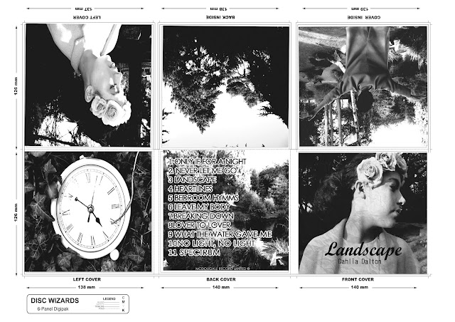
This was a quick draft of my digi-pak that I created.


This was a quick draft of my digi-pak that I created.

STEP 1

Firstly, I opened my choosen image for my album cover into Photoshop using File and then Open. Then, duplicated the layer by going to Layer - New then Layer via Copy.

Then to change the image to black and white I went to Image - Desaturate which basically removes all colour from the image. After this, I again made another layer by the same commands.

Changing the image so it's inverted meaning the light parts of the image turn black and vice versa I basically went to Image - Adjustments - Invert. Also, changing the blend layer to Colour Dodge making the image completely blank.

Here, to get the sketch effect I chose Filter- Other - Minimum and left the Radius and Pixel at 1. Then Merge visable to merge the two layers together.

To finally add colour to the image I basically duplicated the original background and also changing the Blend Layer to Colour with a 65% Opacity adding a hint of colour to the image.
After adding the text and filling in the background I decided I was get going to make another draft and alter a few changes. For example, I want to make the background a lighter ivory colour to blend into the image as it's too yellowy. I also wanted to change the text with the pink outline around it, I want to make it stuttle and make the pink the same as the floral headband.
Heres my 3rd and final draft of my CD Album Cover that will be the central part of my digi-pak.

For the text on my album cover I basically used a website called dafont.com which is a website containing lots of different fonts which you can either download or type in the word you can to sample it and what I did, was save it as an image and put it on my product. I decided to use a different website as I found the fonts that already came on the Photoshop software very limiting and didn't have the types of handwritten fonts I was looking for.

Thursday 14 March 2013
CD Digi-Pack Research
ALBUM COVERS
Firstly, I have been researching some album covers relating to my genre of indie-pop as different genre's will promote their albums in different graphics to appeal to the audience. I also wanted to look at other album covers to get some inspiration for my digi-pack.
Here's an album cover that really stood out to me whilst researching different album covers. Kate Nash is a particular artist I enjoy but never seen an album cover from her before. I really liked the contrast between the different images as some seen to be actual photographs that have been taken whilst others are graphics that have probably been created on a computer software or perhaps hand drawn then scanned in and edited. The layout of the album is also very interesting using the graphics in different places emphasising the fact that Kate Nash is an unusual artist and there's not another artist like her.
Firstly, I have been researching some album covers relating to my genre of indie-pop as different genre's will promote their albums in different graphics to appeal to the audience. I also wanted to look at other album covers to get some inspiration for my digi-pack.
 |
| Kate Nash - My Best Friend Is You
|
Wednesday 13 March 2013
Subscribe to:
Posts (Atom)